Zebble is a digital wellness company that built the world’s first bedside companion for modern rest, combining a calm mobile experience with a physical device.
Visit product websiteProduct Design Lead
Scope:
Mobile app experience, bedside device UX, and early website design for launch.
Create a phone-free bedside experience that balances rest, connection, and wellbeing so people can unplug at night, stay reachable to priority contacts, and wake to a calm, simple summary.

Our goal was to measure how Zebble’s calm-tech design improved both emotional confidence and ease of use during early testing.
People want better sleep and less screen time, but most wellness apps still depend on phones, the very thing users are trying to escape.
Our challenge was to help users disconnect without anxiety, ensuring they could sleep peacefully without fearing they’d miss something important.
I worked across the mobile app, pairing with the hardware team to align the digital and physical experiences.
My design direction emphasized reassurance over restriction, a calm, low-stimulation interface that helps users step away from their phones with confidence, with simplicity prioritized over multiple screens.
Core principles that shaped the design:
70% of participants said they couldn’t turn their phone off “just in case.”
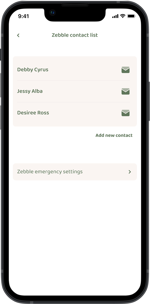
I introduced Priority Contacts. Only approved calls or messages ring through. I suggested adding soft light indicators on the device to show connection status (reachable, muted, or offline).
Impact: 9/10 testers said they finally felt comfortable sleeping phone-free.
People said they often opened a sleep app, adjusted a few settings, then drifted straight into social media. The apps weren’t helping them log off, they were keeping them engaged.
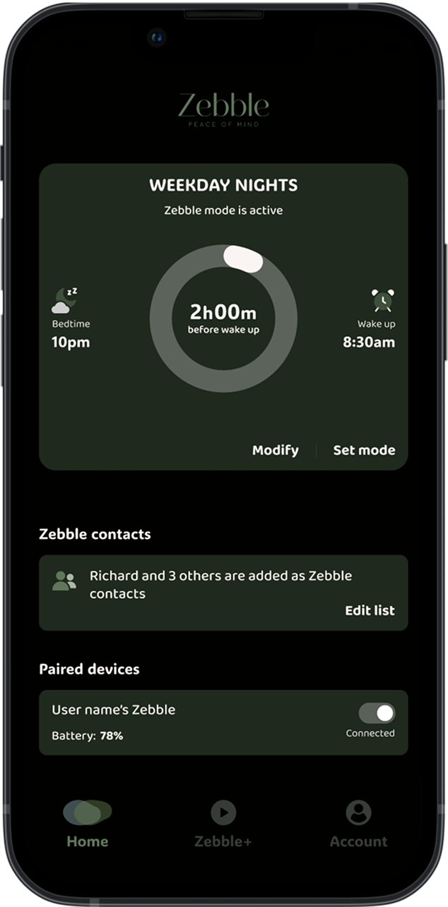
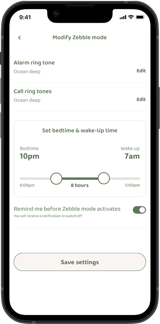
I introduced Zebble Mode. which activates automatically at the user’s scheduled bedtime.
When active, the app switches to a dark interface, reducing brightness and visual noise. Call filtering starts automatically, allowing only approved “Zebble contacts” to reach the user.
The progress ring dynamically updates to show “X hours before wake-up”, creating a calm visual countdown.
At wake-up time, Zebble Mode deactivates itself, returning to light mode and displaying a morning summary of sleep and unplug time.
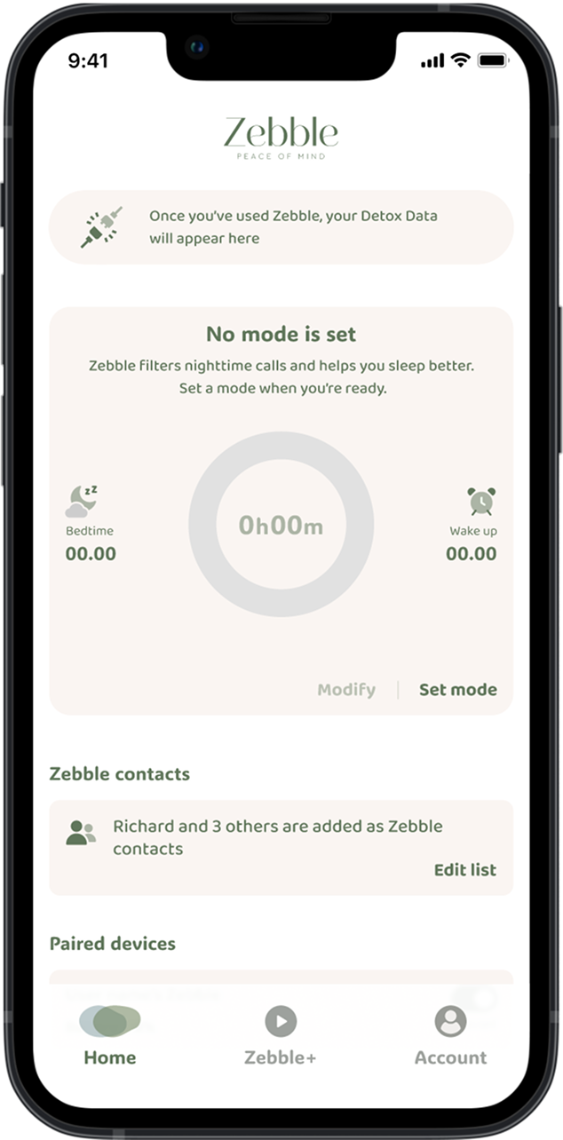
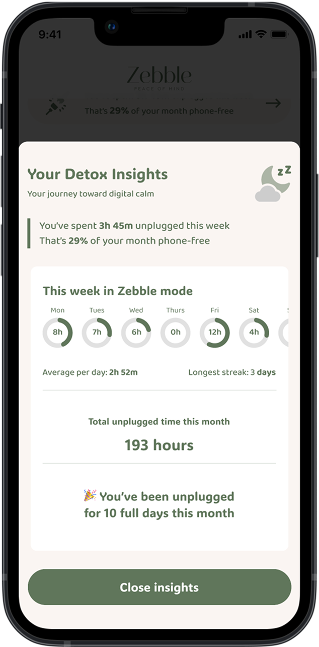
Most wellness apps overwhelm users with harsh feedback and sleep “grades.” People felt pressured, not supported.
Introduced friendly, factual summaries like “You’ve spent 3h 45m unplugged this week, that’s 29% of your month phone-free.”
Framed data as progress, not performance, using neutral tones and warm gradients instead of competitive streaks or alerts.
I combined both quantitative and emotional reinforcement, pairing measured outcomes (e.g “8h of peace scheduled”) with language that feels human and gentle.
Result: Users described the experience as “peaceful and encouraging,” leading to more consistent nightly use without the fatigue of traditional trackers.
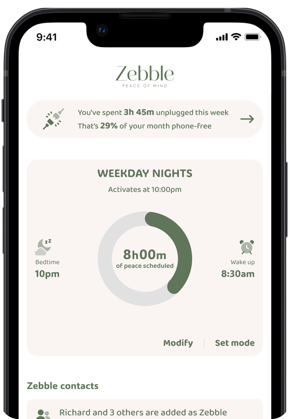
Many early testers were older adults or people experiencing anxiety around constant notifications. They wanted digital calm, but most wellness apps were too complex, overloaded with menus, analytics, or unnecessary metrics. As one tester said, “I just want to set my time, know I’m safe, and go to sleep.”
I designed Zebble’s interface around clarity, legibility, and trust rather than quantity of features:

This project reinforced that emotional calm and accessibility can coexist. Simplicity isn’t less, it’s trust made visible