In Nigeria, finding reliable help can be stressful. Takers App makes it easy and safe to get things done, with escrow payments, verified profiles, and a clear, step-by-step process that keeps everyone accountable.
Visit product websiteProduct designer. I led end-to-end design from discovery to prototype validation.
I also created component patterns for consistent, accessible interfaces.
Create a safe, trust-first marketplace where users can hire or earn securely, designed for simplicity and reliability.
Even before launch, people responded strongly to the concept.
People rely on local workers every day for cleaning, errands, or tutoring but they don’t always trust them to show up or finish the job.
Workers, on the other hand fear not getting paid. The gap between both sides is trust.
I started by talking to potential users on both sides, Posters and Takers (Helpers). I mapped their journeys, highlighted every trust gap, then designed I designed the product around three principles:
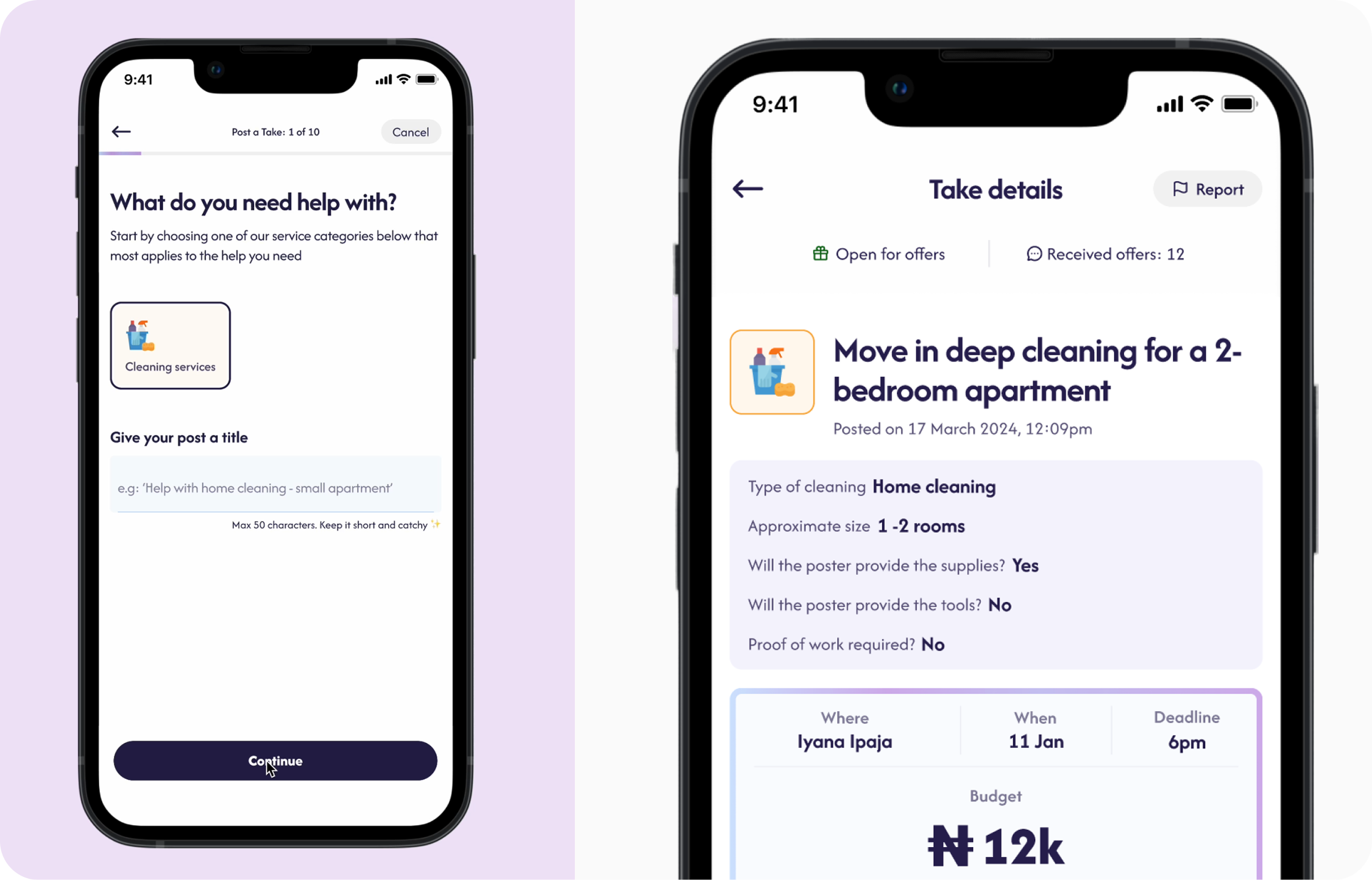
Users often created vague task posts such as “Need cleaner tomorrow,” which led to misaligned expectations, late arrivals, and disputes over scope.
I identified a core behavioral pattern: users wanted quick posting, but lacked clarity on what details service providers needed to give accurate offers.
I designed a guided posting flow that helps users describe their tasks clearly without adding friction.
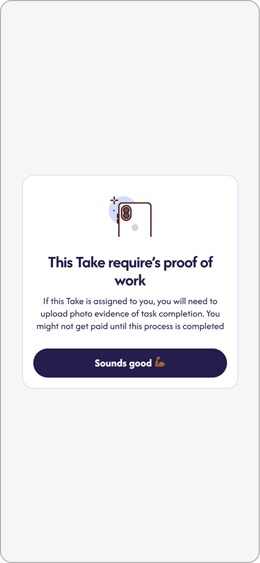
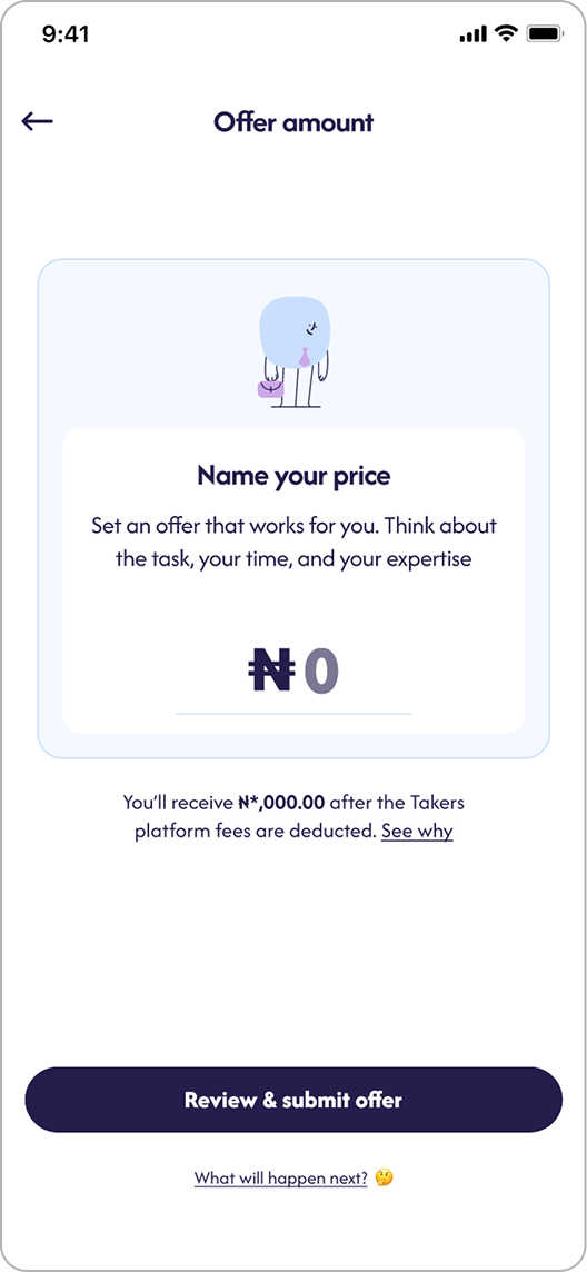
The form dynamically adapts by category and prompts for key details: what kind of task, who provides tools, when it’s needed, and proof of work required.
Each flow ends with a short summary preview, helping users confirm scope before posting.
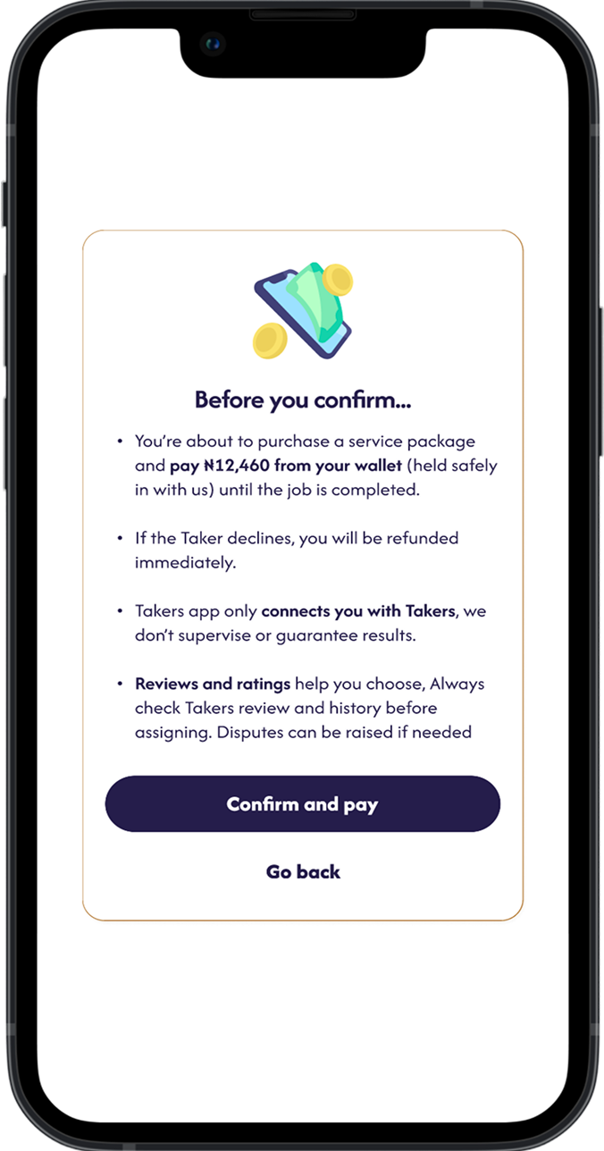
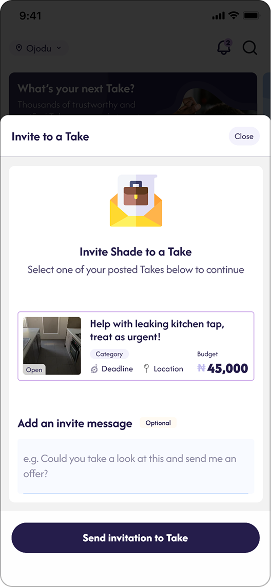
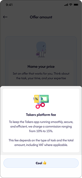
Both sides were hesitant to transact online. Posters didn’t want to pay upfront without proof of work, and Takers (service providers) refused to start without assurance of payment. This created stalled transactions and mistrust before any engagement even began.
I introduced an escrow payment system that builds trust by holding funds securely until the task is completed.
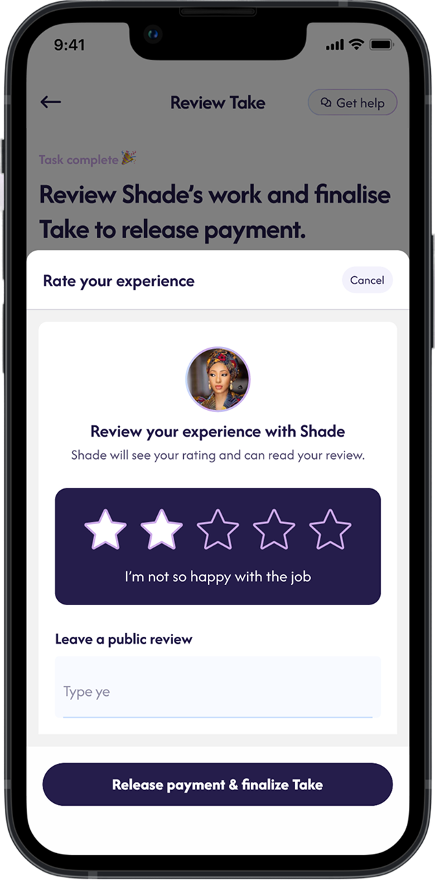
Once a Taker is assigned, the Poster deposits payment, which remains safely held in escrow. Funds are released only after the Poster approves the completed task or automatically after a short grace period.
Users said they preferred WhatsApp because it felt faster and more reliable, but once they left, support couldn’t help during disputes.
I designed an in-app chat tied directly to each task.
It includes photos, system notifications, and real-time updates (like payment confirmation or deadline changes).
Now, all information stays in one place, transparent for users and admins alike.
I kept the chat UI minimal on purpose, familiar like WhatsApp but anchored to each Take. This balanced trust and safety (traceable conversation).
Result: In testing, 7 of 9 users said they’d “rather just chat here” after seeing message receipts and automatic status updates.
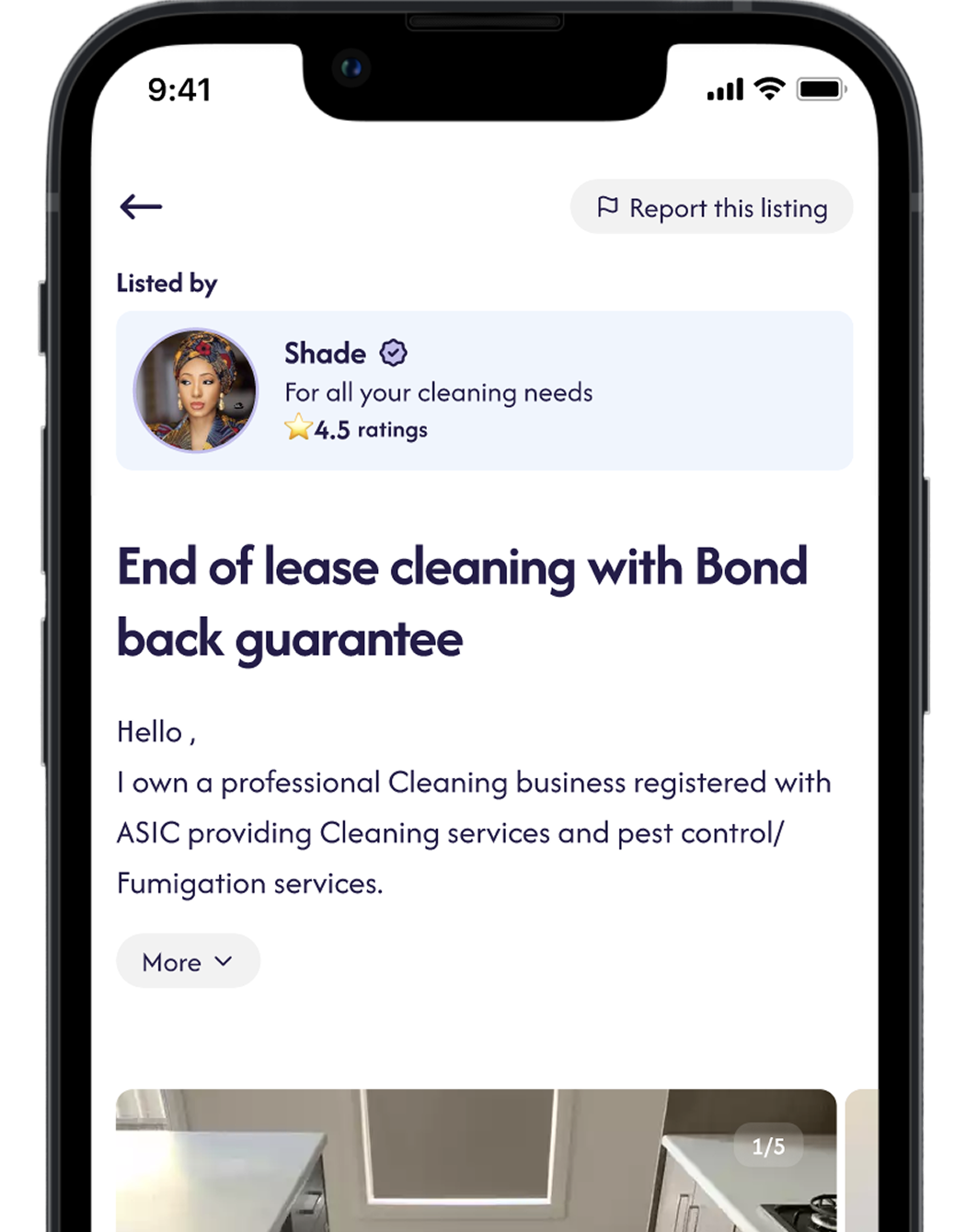
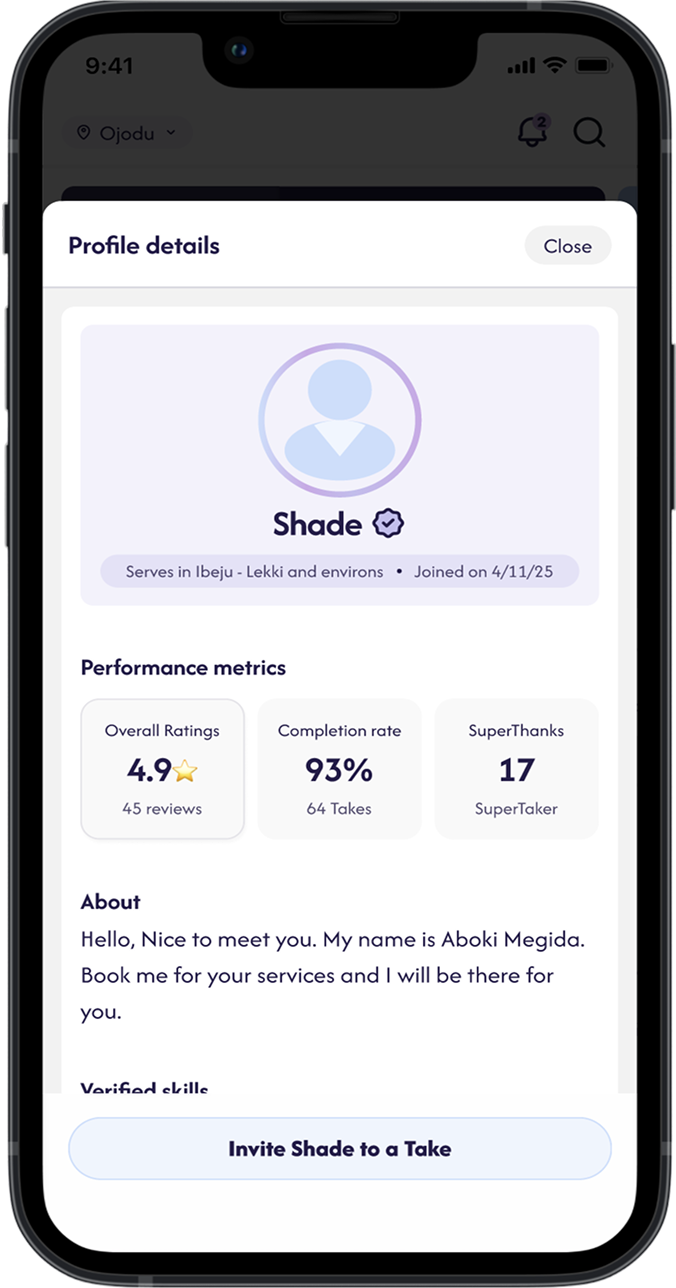
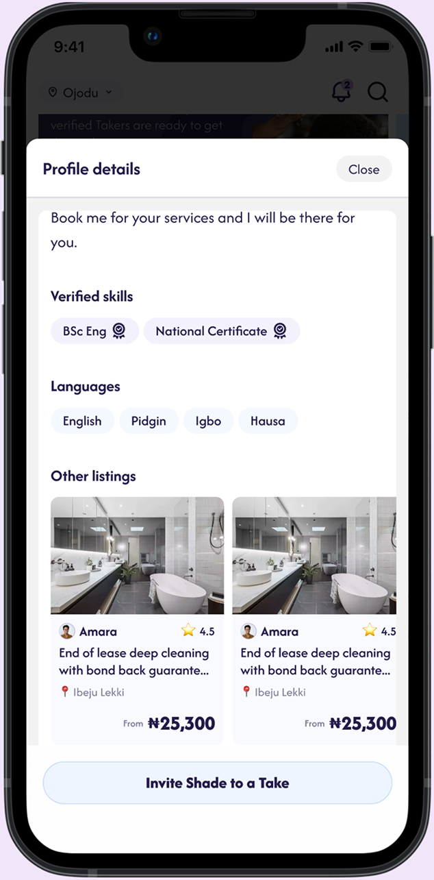
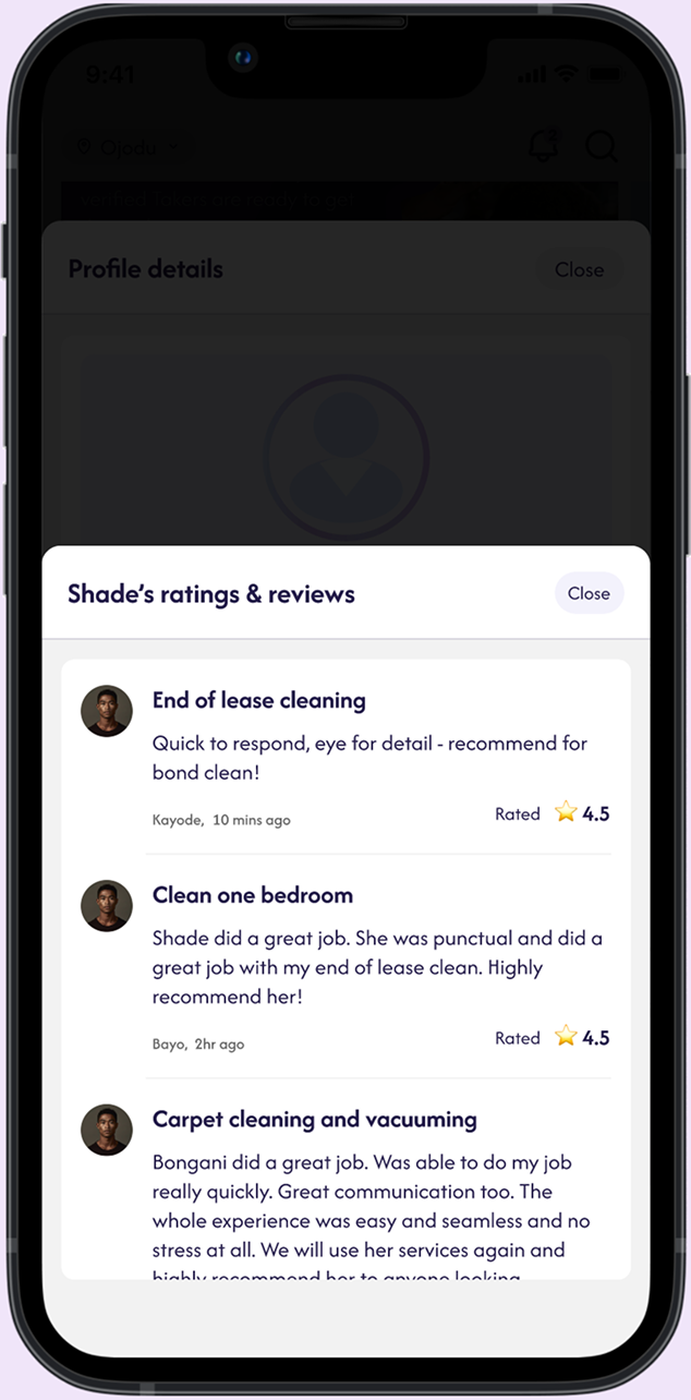
New Takers had no credibility. Posters only wanted people with reviews.
Posters didn’t read long reviews, they wanted quick signals like on-time rate and average rating.
I prioritized metrics that prove reliability visually: completion %, average rating, and verified ID.
Trade-off: We dropped “hours worked” because early testers found it confusing for short jobs.
Result: Profiles with visible metrics were 3× more likely to get hired during pilot tests.
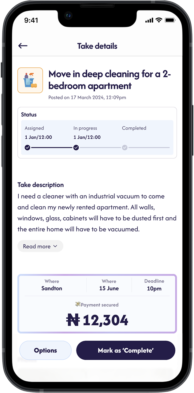
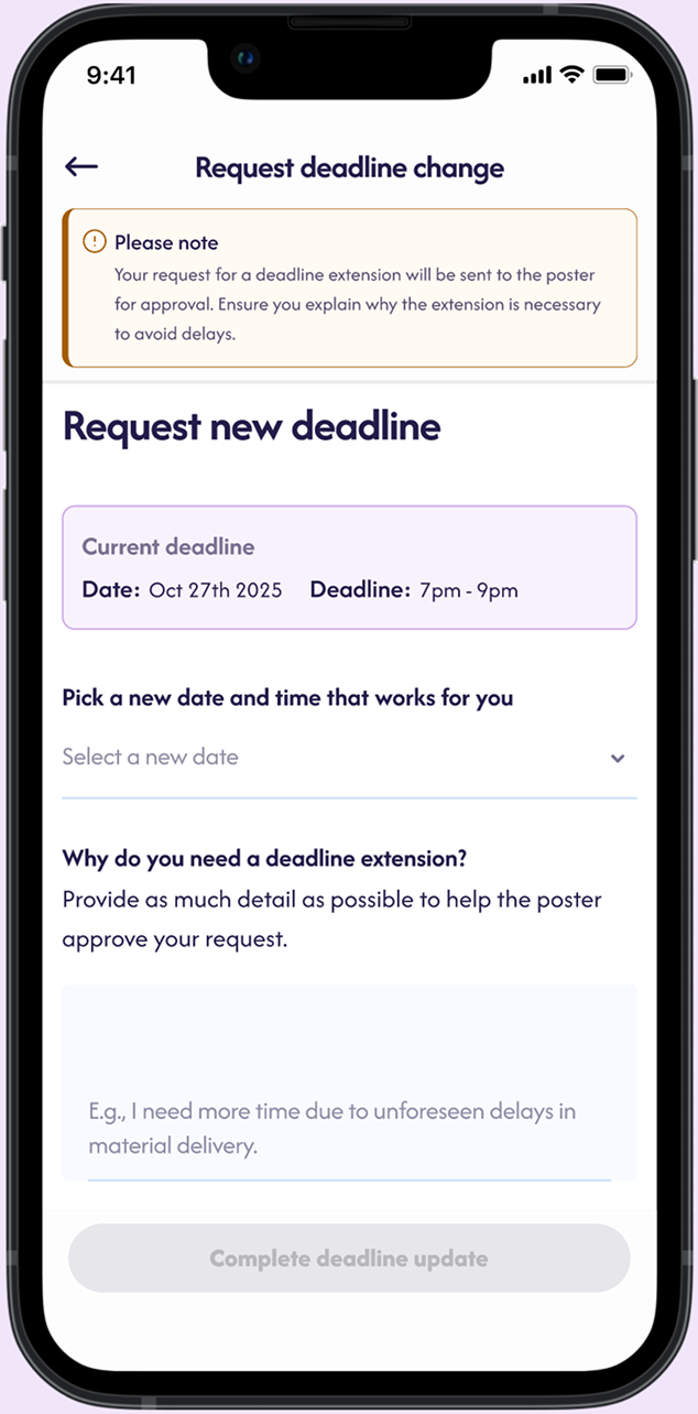
Users asked “Has the job started?” or “Do I still get paid if they cancel?” The flow lacked checkpoints.
We designed a structured task lifecycle:
Open → Assigned → Started → Pending Review → Completed.
Every state has reminders, timers, and status updates, so no one’s left guessing. I also designed possibility to request and extend deadlines.
After multiple rounds of iteration, we launched a clickable high‑fidelity prototype to a beta group of 50 users.
We incorporated these learnings into the final design, which included the guided posting flow, in‑app chat, profile verification and structured task lifecycle described earlier.
.svg)


.png)
.png)
.png)